Everything seems to eventually evolve and Web fonts are no exception, especially with the emergence of Google’s freely-available, no-restrictions font library. It’s been around for awhile now, but not everyone is aware of it.
For the longest time, text on screen all looked the same except for maybe the size, color and weight (normal or bold). It was boring, tiresome and downright uninspiring. As with print design, type is crucial to an effective campaign.
Sure, even before Google fonts, you could convert your personal and commercial fonts to some web-equivalent formats, then upload, link and apply them after you shelled out an exorbitant amount of money just to be able to legally use that particular font on your website. You don’t have those limitations or restrictions with Google. In fact, they host them for you…you don’t even need to download or convert them…they’re just ready to go once you’ve linked to them.
They don’t have everything and they don’t always have full families, but there are tons to choose from and finding that balance of what works with your initial designs and what pairings will work well together takes some thought.
There are now more services offering web fonts; some paid, some free, and the list will only get larger. The future of typography on the Web is exciting and adds a whole new dimension to us as Web designers.
Take a look at some of the offerings from Google’s font library at https://fonts.google.com/ and don’t feel like you have to settle for Arial and Times Roman.
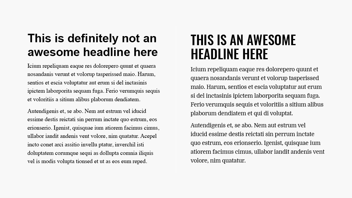
Here’s a simple example of your old-school fonts vs some standard Google fonts (I don’t know about you, but I would much rather read the one on the right.)